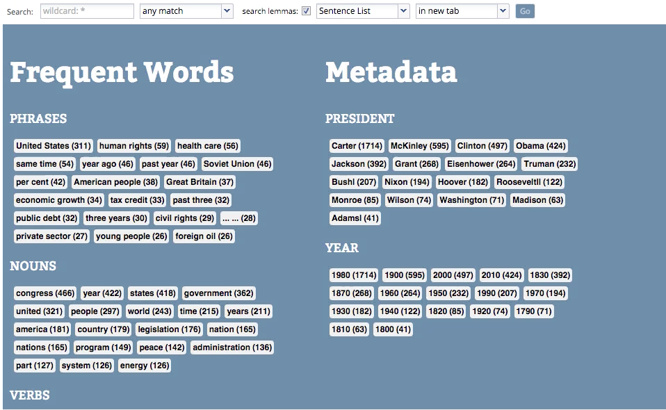
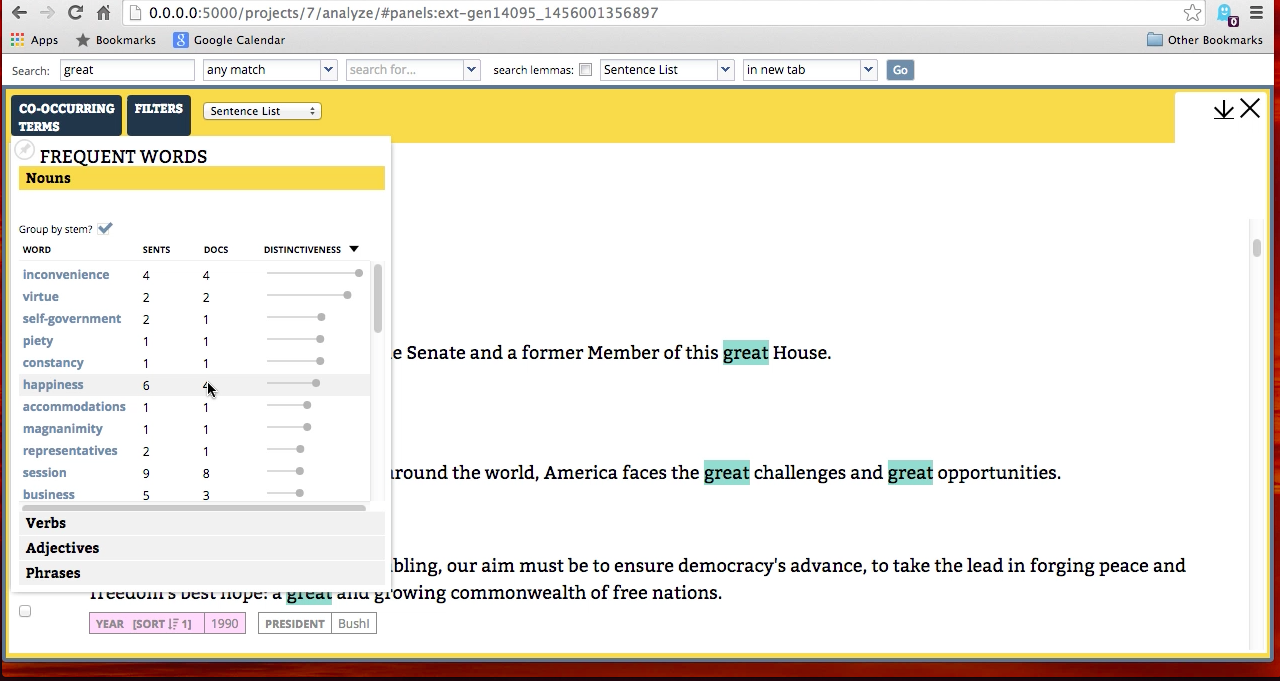
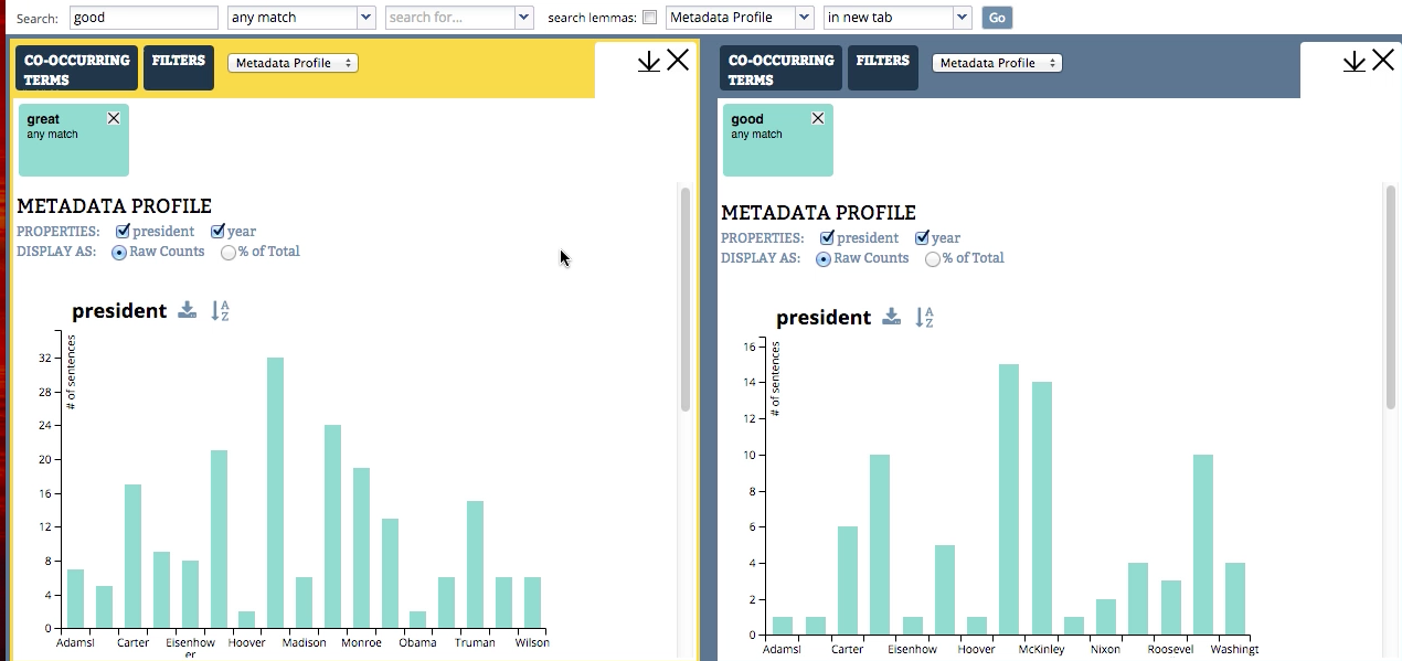
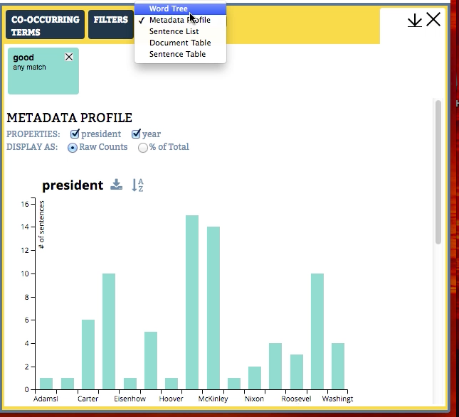
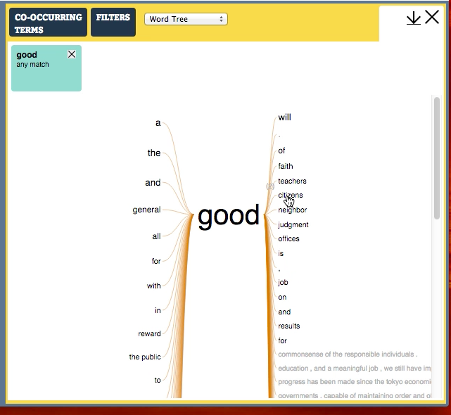
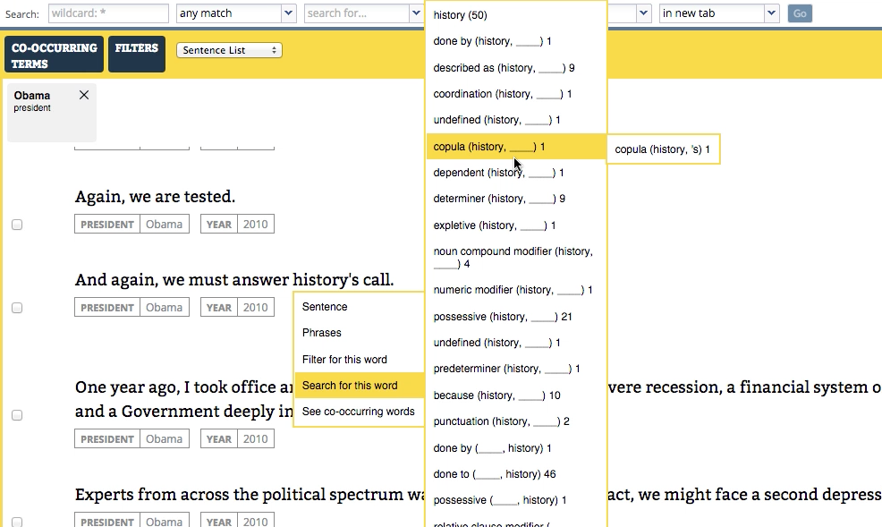
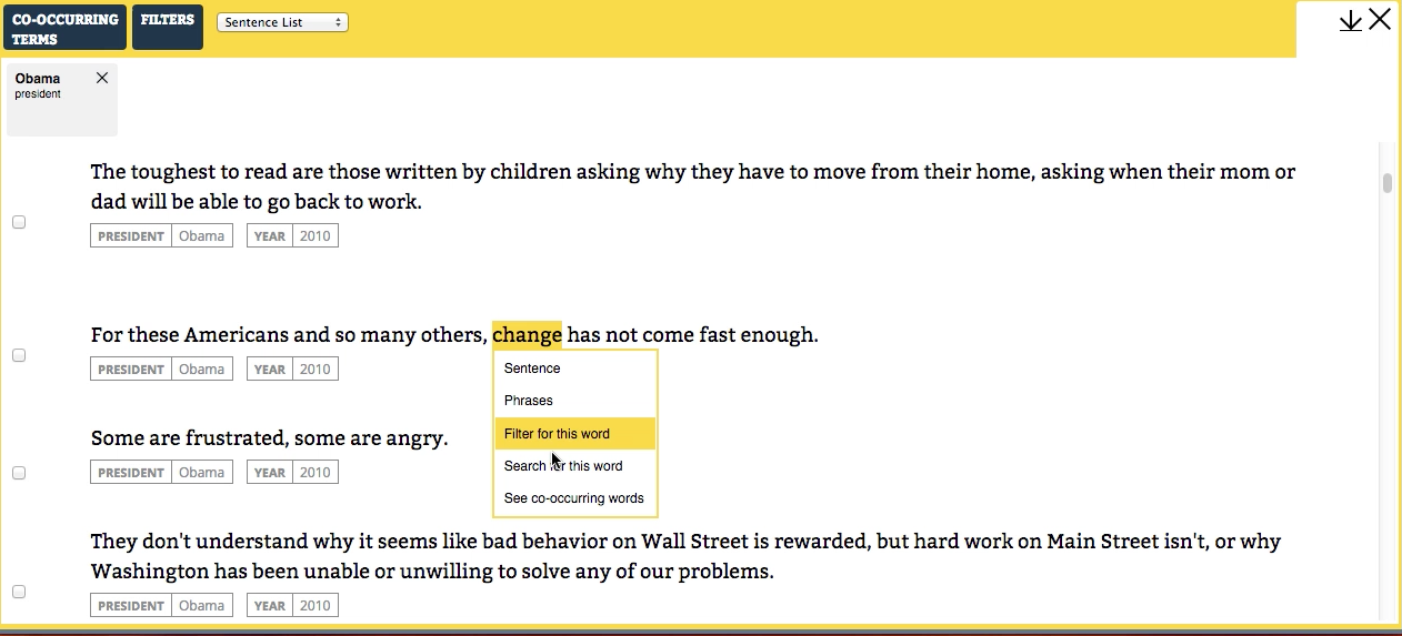
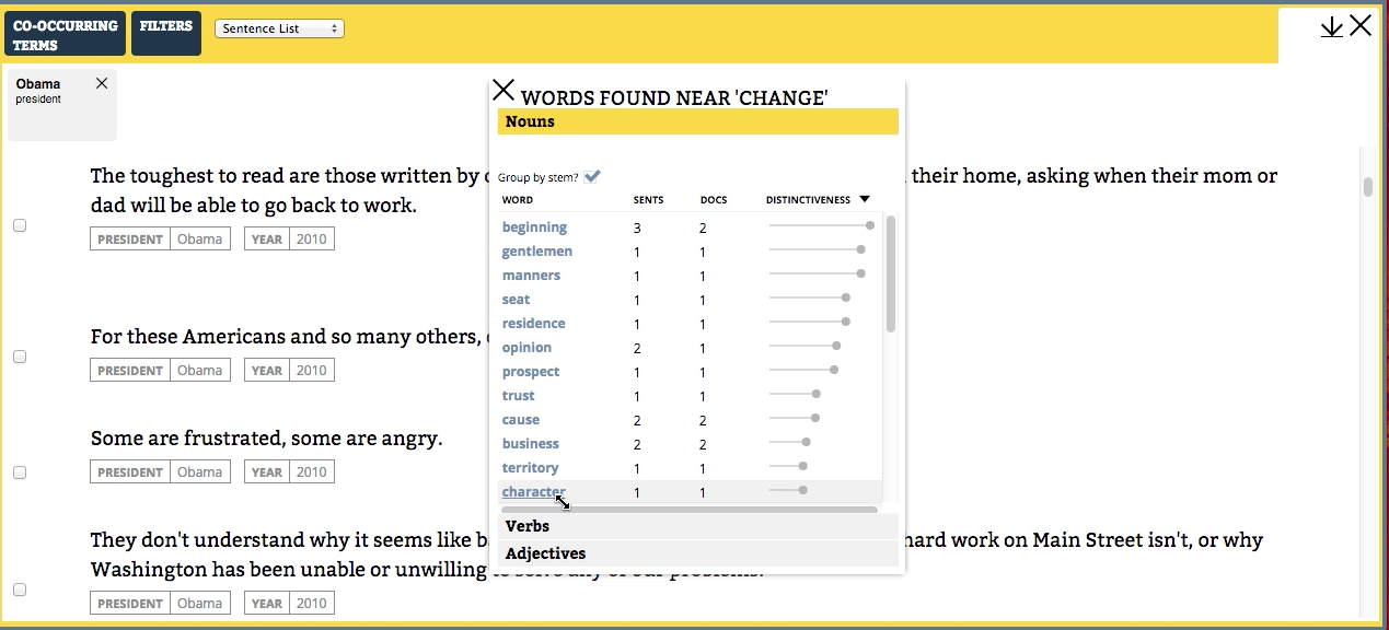
WordSeer 4.0: Updated Look and Feel
WordSeer 4.0 has a modernized and streamlined user interface that breaks up some of the screens and uses color to better effect to differentiate the functionality. The screenshots below illustrate the functionality, much of which was present in WordSeer 3.0, but using visual hierarchy and color to better differentiate the different operations and functions.
![Starting page for the WordSeer interface, on State of the Union documents.](https://wordseer.berkeley.edu/files/2016/02/sotu_overview.png)
![Co-occuring terms.](https://wordseer.berkeley.edu/files/2016/02/sotu_coocurring.png)
![Compare metadata on the word great.](https://wordseer.berkeley.edu/files/2016/02/sotu_compare_metadata.png)
![Change views from metadata summary to WordTree](https://wordseer.berkeley.edu/files/2016/02/sotu_select_wordtree.png)
![WordTree view on the word good.](https://wordseer.berkeley.edu/files/2016/02/sotu_wordtree.png)
![Related terms based on syntax.](https://wordseer.berkeley.edu/files/2016/02/sotu_history_syntax_related.png)
![Select related terms in context.](https://wordseer.berkeley.edu/files/2016/02/sotu_change_select_related.png)
![Co-occurring terms selected in context.](https://wordseer.berkeley.edu/files/2016/02/sotu_change_related.png)